Monday, April 29, 2013

What is Usability? A belated overview.

Belatedly, I have realized that I plunged into topics relating to usability without ever providing much detail on the overarching idea of usability itself. However, the concept is as straightforward as it sounds. The International Organization for Standardization (ISO) defines usability as the effectiveness, efficiency, and satisfaction with which specified users achieve specified goals in particular environments1. In web interface and design this refers, in short, to user-friendliness and ease of use. In the Neal-Schuman Library Technology Companion, John J. Burke provides the following tips:
  • Resist the desire to tell users everything.
  • Seek input from users to help improve interfaces.
  • Look at what others have done2.
The first of these tips reminds the interface designer not to overload the user with an overabundance of information. While there may be a great deal of information that needs to be conveyed, it must be organized effectively. Concise headers, links, and the like (along with suitable color schemes and distinct boundaries between sections of the page) allow users to quickly locate what they are looking for. Conscientious design, along with the use of appropriate navigation tools, allows for conveyance of all desired information without overwhelming the user.
The importance of simplicity in interface applies also to graphics, sound, and other features. Unnecessary or overly flashy graphics can detract from the quality of an interface when they needlessly distract the user or have the potential to be regarded as a nuisance. This is not to say that websites are meant to be austere and uniform; what is crucial is for features to be complementary to the site's structure and purpose. For example, it is generally frowned upon to have sound or video play automatically when a page loads, but it can be acceptable if it is meant to accompany an interactive feature of the site.

Burke's second piece of advice is self-explanatory. It is a great idea to allow users to provide feedback on the site design and interface. By way of user input, the designer may gain a better understanding of the use and navigation of the site, and be enabled to identify changes that should be made or considered.

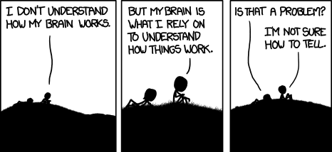
But do make sure any feedback that is submitted is able to reach you successfully! The artist of the webcomic XKCD offers the following strip3, noting that "it can take a site a while to figure out that there's a problem with their 'report a bug' form."
The final tip imparted by Burke is to consider the designs and principles that are already in use by others. Existing sites of a similar nature may have stylistic features in common; is there a reason for this? Consider whether an existing layout exemplifies what the typical user expects out of the site's appearance, and whether the development of your design should be guided by it. Recall the previous post on OPAC interfaces. In terms of appearance, features, and organization, what did the sites examined in the screencast have in common? Are they similar to the library website you use most frequently? Have you come to expect an interface that follows this general design?

References
1. ISO. (2008). ISO 9241-151:2008. Ergonomics of human-system interaction -- Part 151: Guidance on World Wide Web user interfaces.

2. Burke, J.J. (2009). Neal-Schuman library technology companion: A basic guide for library staff (3rd ed.). New York, NY: Neal-Schuman Publishers, Inc.

3. Munroe, R. (2013). XKCD: Debugger. http://xkcd.com/1163/

Thursday, April 11, 2013

Usability and the OPAC

For a recent project that required the production of a video or slideshow, I chose to create a screencast showcasing extra features that have become a part of current (or "next-generation," though this term understates their present prevalence) OPACs. I refrained from going into detail on searching methods or theory, or the construction of advanced search queries -- each of those topics is worthy of much more disquisition than could be offered in such a brief presentation. Instead, I selected a single piece of literature, and based the demonstration on simple searches of its title. Check below the break at the end of this entry if you would like to view my project.
An aside on screencasts -- Heretofore, I was really only familiar with the use of screencasts for programming tutorials. I was intrigued and wanted to try my hand at one; this seemed like a good opportunity. I searched around for a bit after I'd completed mine, only to find very quickly that I've fallen behind the times for sure: Libraries have already been using screencasts for quite a while now.
Although I did not touch on the subject in my project, the sampling of various OPAC interfaces got me thinking about the usability of their enhancements. These updated interfaces are undoubtedly user-centric, offering services to enhance search, access, and research.

The search interface on a well-designed library website is featured prominently on the main page, usually front and center, drawing attention with attractive colors and well-defined boundaries. Tabs or buttons often allow the user to search for specific media types (books, articles, video, e-books, and so forth), and often a drop-down menu can be found to the right of the search box, allowing the user to limit the search to such criteria as keyword, author, title, subject. A link for advanced searching is almost always provided, as is a link to the unembellished "classic" search interface.

This presentation allows for optimal ease of use -- no extraneous clicks are needed to navigate to the search, the overall layout is relatively universal for all OPACs regardless of the software used to build them. The user does not need to learn how to navigate a new system when searching different libraries' catalogs.

Upon entering a search, the user is greeted not only with search results, but with the option to refine the search by limiting any of various characteristics -- availability, location, format, subject, author, publication date, et cetera. These have long been features of database searches like EBSCO, and are generally designed to bear a similar presentation. Kept as a sidebar, they are unobtrusive yet readily accessible.

Along with standard detailed item records, most current OPACs offer at least some of the following services on individual records:
  • Send the record to yourself via email or text message
  • Generate a citation or export data to reference management software (e.g., EndNote, RefWorks)
  • Share the record through various social media
  • Add the record to a personal, user-generated list
  • Request the item
  • Add comments, tags, or reviews
  • View "similar" items*
* I haven't yet tried, but it may be worthwhile to investigate how these lists of similar items are generated, and whether they can be configured. Are they based on subject matter? Author? Call number vicinity? The lists I've seen on the searches I have conducted have appeared intuitive so far; though I have admittedly given minimal attention to this feature, I have yet to notice any inexplicable results.


What is your take on OPAC usability? What areas of the catalog search do you find particularly useful or especially cumbersome?


Check below the break to view my screencast.

Monday, February 4, 2013

Considering the Audience

In planning any website, a necessary step is to identify the intended audience and their needs. When it comes to the academic library website, primary users will fall into the following categories:
  • Students
  • Faculty/Staff
  • Researchers
What are their needs? What brings them to the website?

A large portion of users will be seeking books and other materials to check out. Clearly, a search function for the library's catalog needs to be featured prominently on the main page; related offerings like journals and databases can easily be incorporated into the same search area.

What else might users be seeking? What other services may visitors expect to find linked from the main page?
  • Library hours and contact information
  • Coming events
  • Reference information
  • Research guides
  • Course reserves
  • Interlibrary Loan
  • Special Collections/Archives

Consider also the audience's skills and level of internet savvy.
If you use complex visuals or flashy interfaces, are certain portions of your audience going to understand how to use and navigate them? If visitors are using outdated software or older browsers, will they be able to view the site properly? Make no assumptions that what you see is the same thing other users see, or that they will understand it in the same way that you do. You will likely find it necessary to discover a balance between what looks good and works well, and what your audience will be able to handle.

While you can make some generalizations about your target audience groups and their needs, it is crucial to realize that individual visitors come with specific and varying demands. Keep an open mind about their expectations when planning the library website.

Thursday, January 31, 2013

Embracing what?

Here begins a blog for MLIS 7500, Computer Applications for Information Professionals. The primary goal of this work is to examine tools, resources, guidelines, and standards for web usability and how they apply to academic library websites. Topics discussed may reflect a wider range of topics related to web design and academic library websites.

Wow! I agonized for weeks over a name for this blog.
I contemplated to no end puns and the like that I might incorporate into some clever title -- something that might give it a little character. I never did come up with one, but this works.

Titles considered:
Heavy Meta -- If I was only taking a topic more cataloging-oriented! It's definitely fitting, for me.
URLs and Purls -- I've been doing a lot of knitting lately, but URLs didn't seem quite relevant enough to the topic.
Meta Head -- I could have made it work. They're both HTML tags, after all, but that's a bit too technical to reflect the intended subject matter.

Embracing usability?
I got too technical again, but I went with it. I was thinking of the curled braces used in CSS.